Don't miss a gem
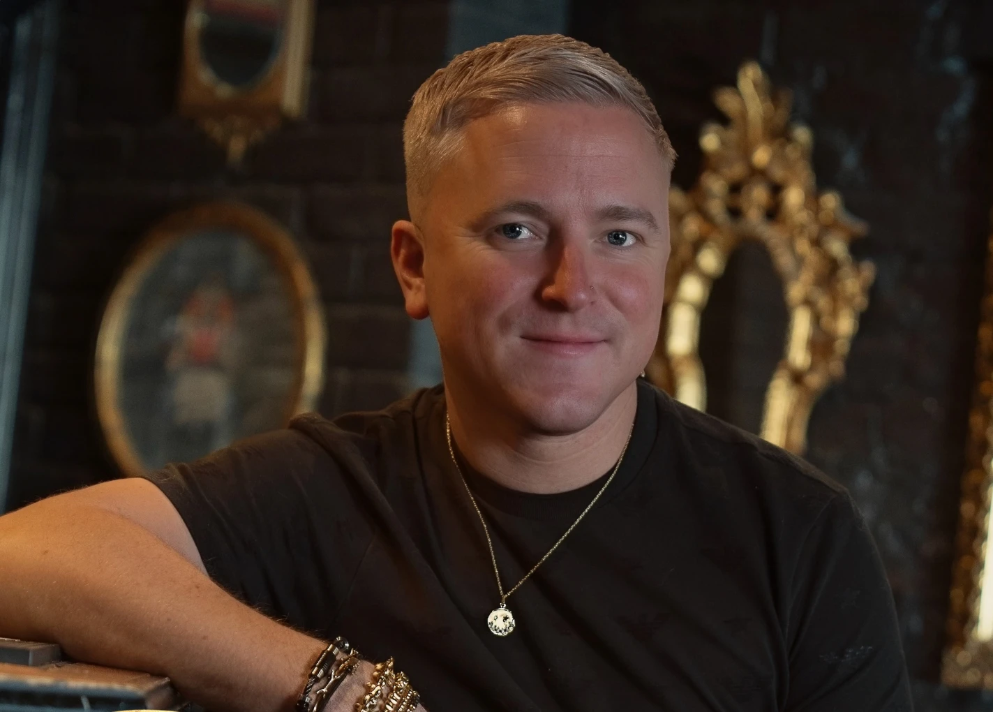
Founder & CEO
Founder of The Jewels Club, Andrew creates platforms that connect the world of jewellery through community, content and access.
Prada has never followed trends. It creates them. And with its latest foray into fine jewellery, the Milanese maison continues to rewrite the rules. Titled Couleur Vivante — “living colour” — the new high jewellery collection marks a chromatic manifesto of sorts. Colour is not a supporting character here. It is the story itself.
Unveiled in July 2025, Couleur Vivante is more than an aesthetic statement; it is an ideological one. Under the co-creative direction of Miuccia Prada and Raf Simons, the collection is driven by the idea that colour should be felt first, categorised second. Stones are not selected based on market hierarchy or rarity, but on their emotional resonance, contrast, and the tension they create when juxtaposed.
In traditional fine jewellery, hierarchy reigns supreme: diamonds dominate, rubies and sapphires follow, and the rest are considered supporting players. Couleur Vivante disrupts this.
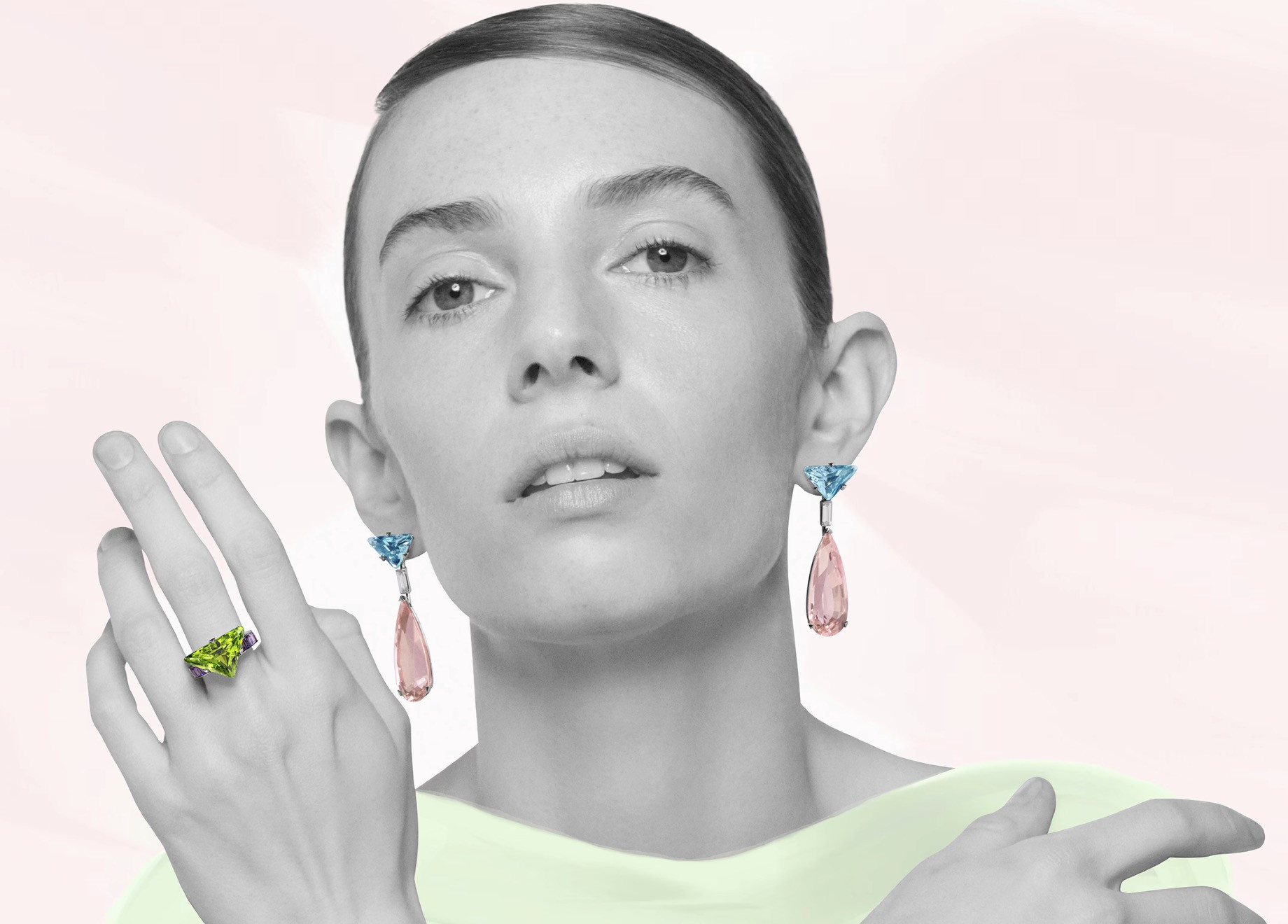
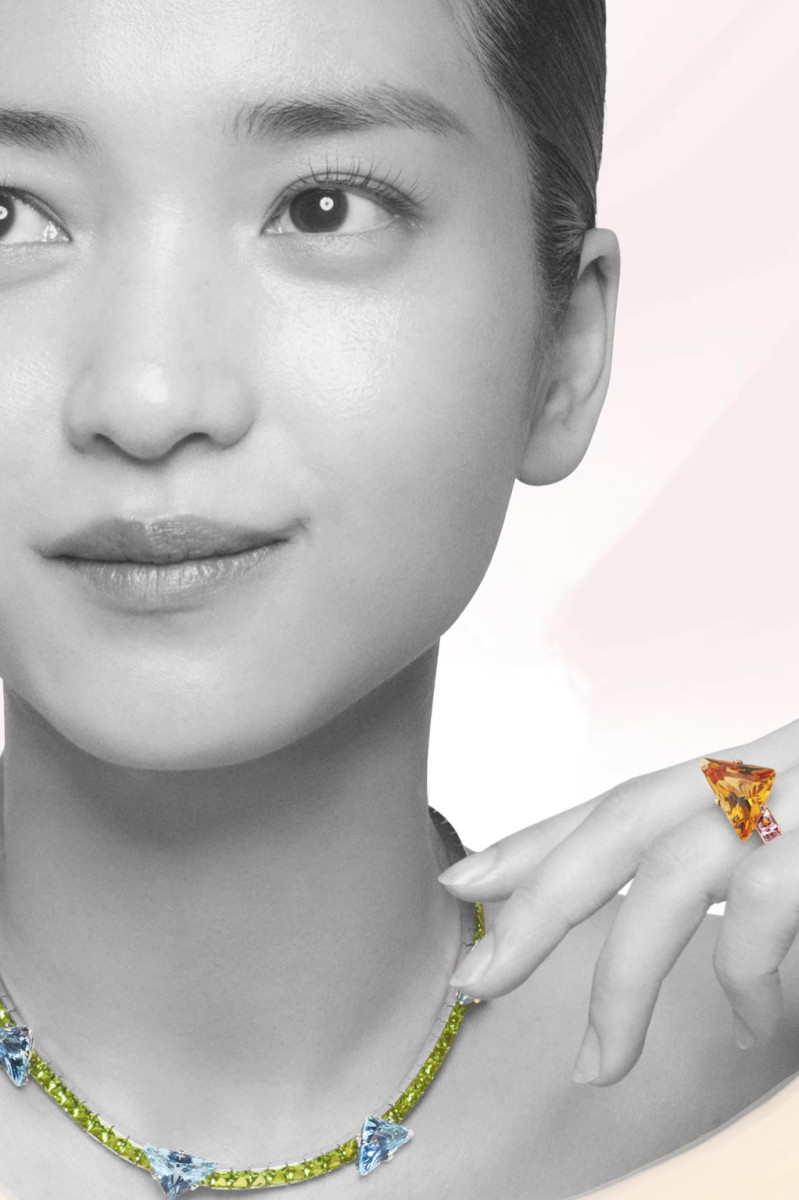
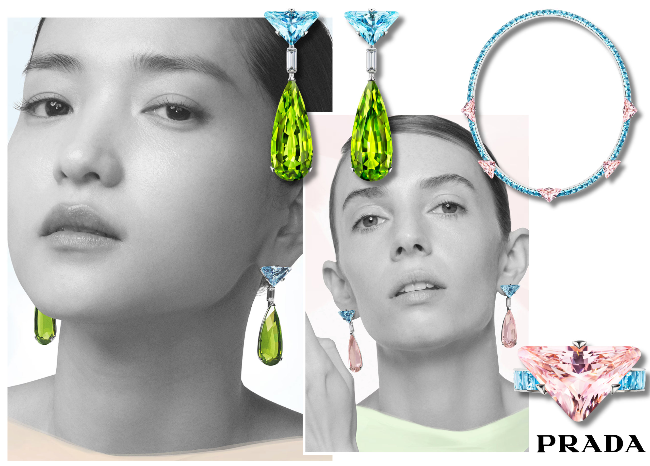
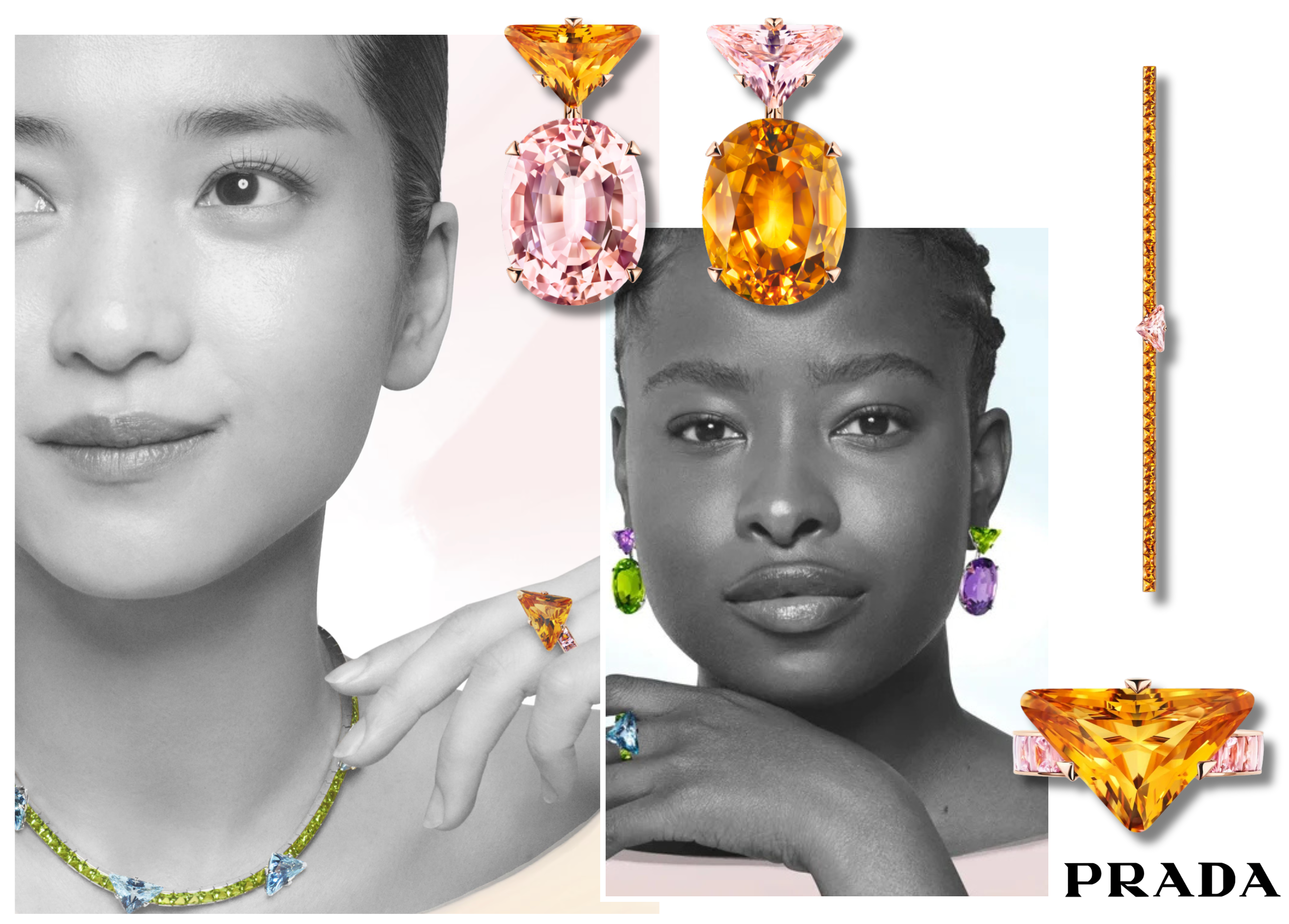
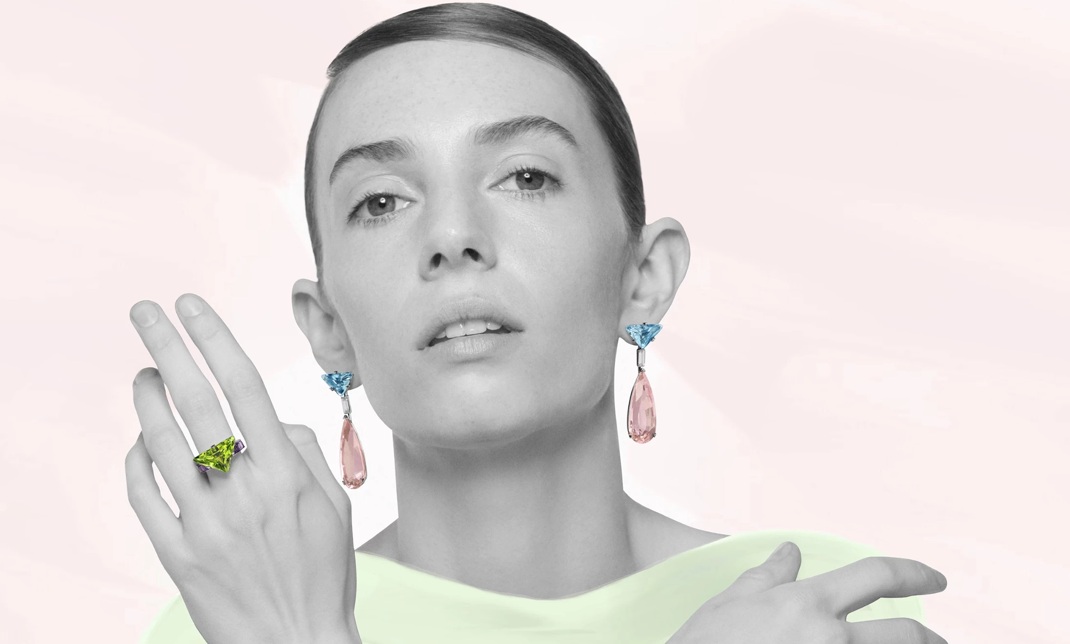
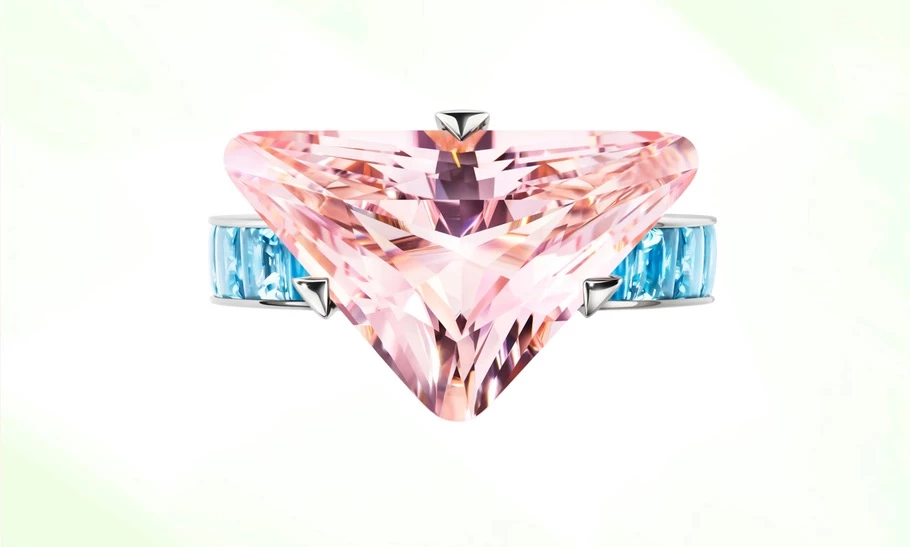
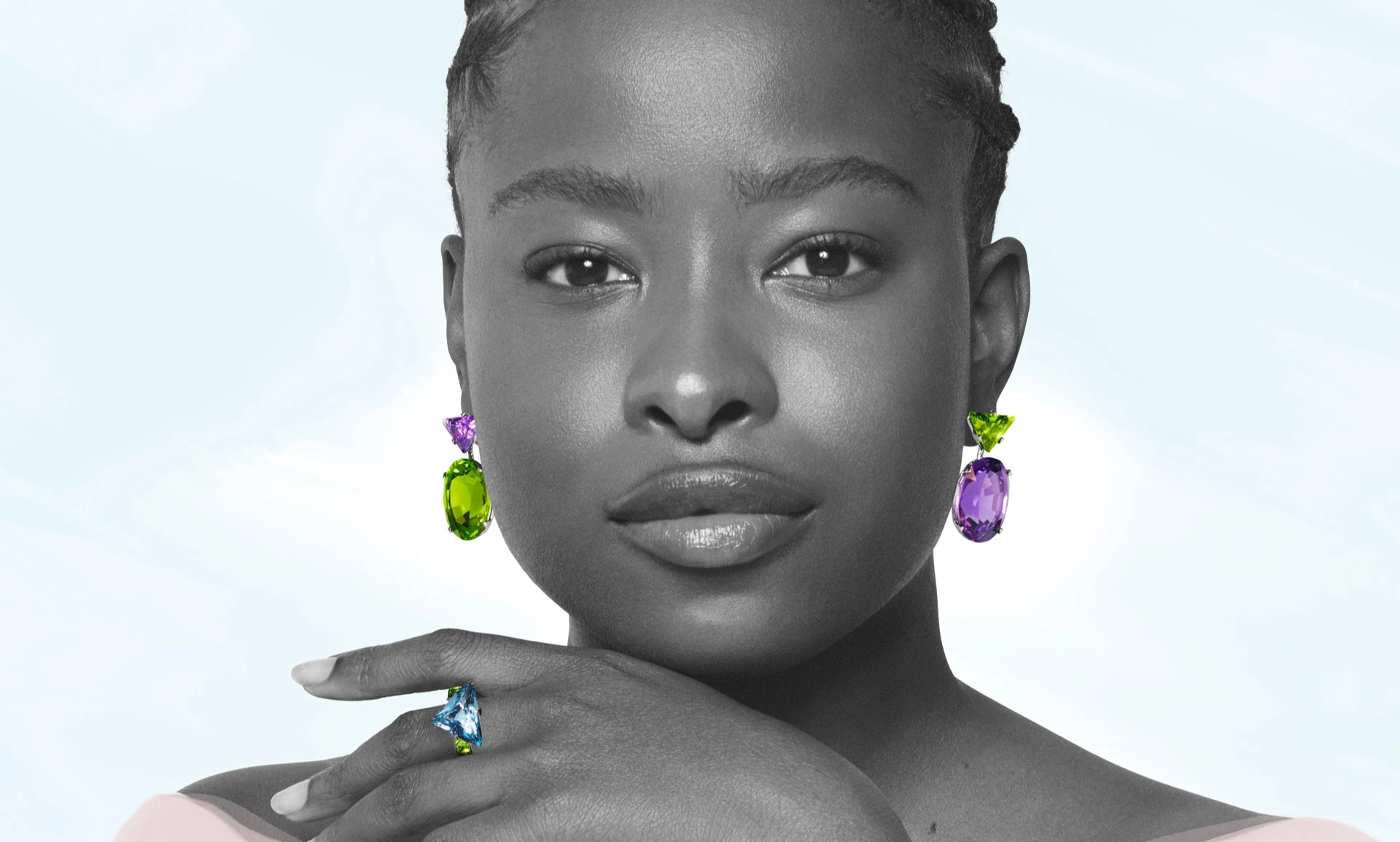
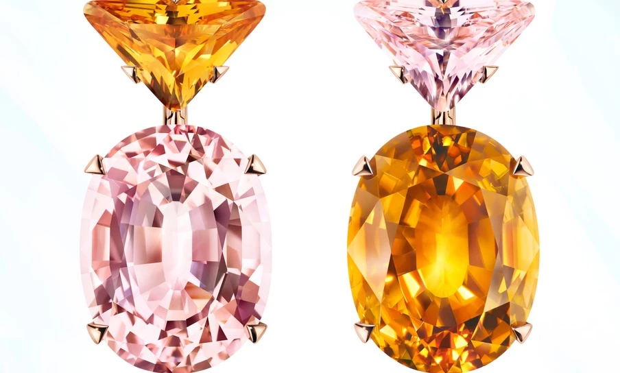
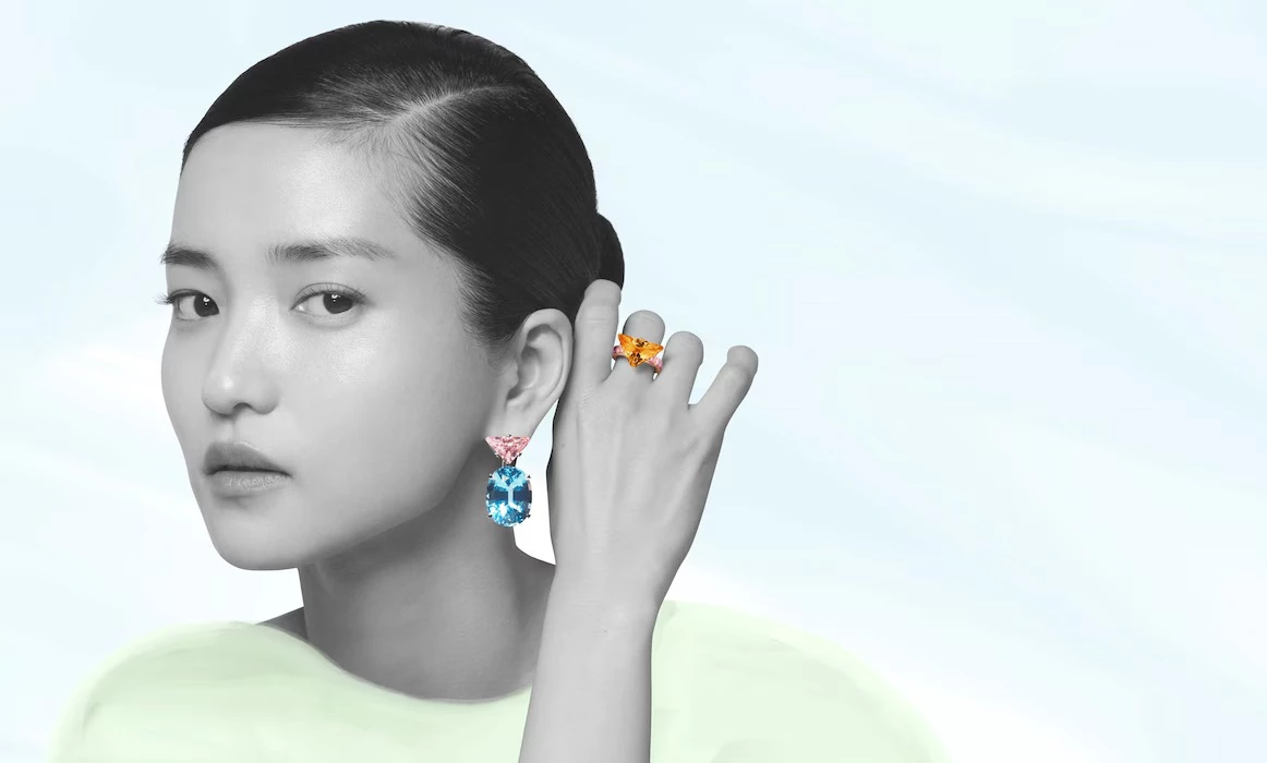
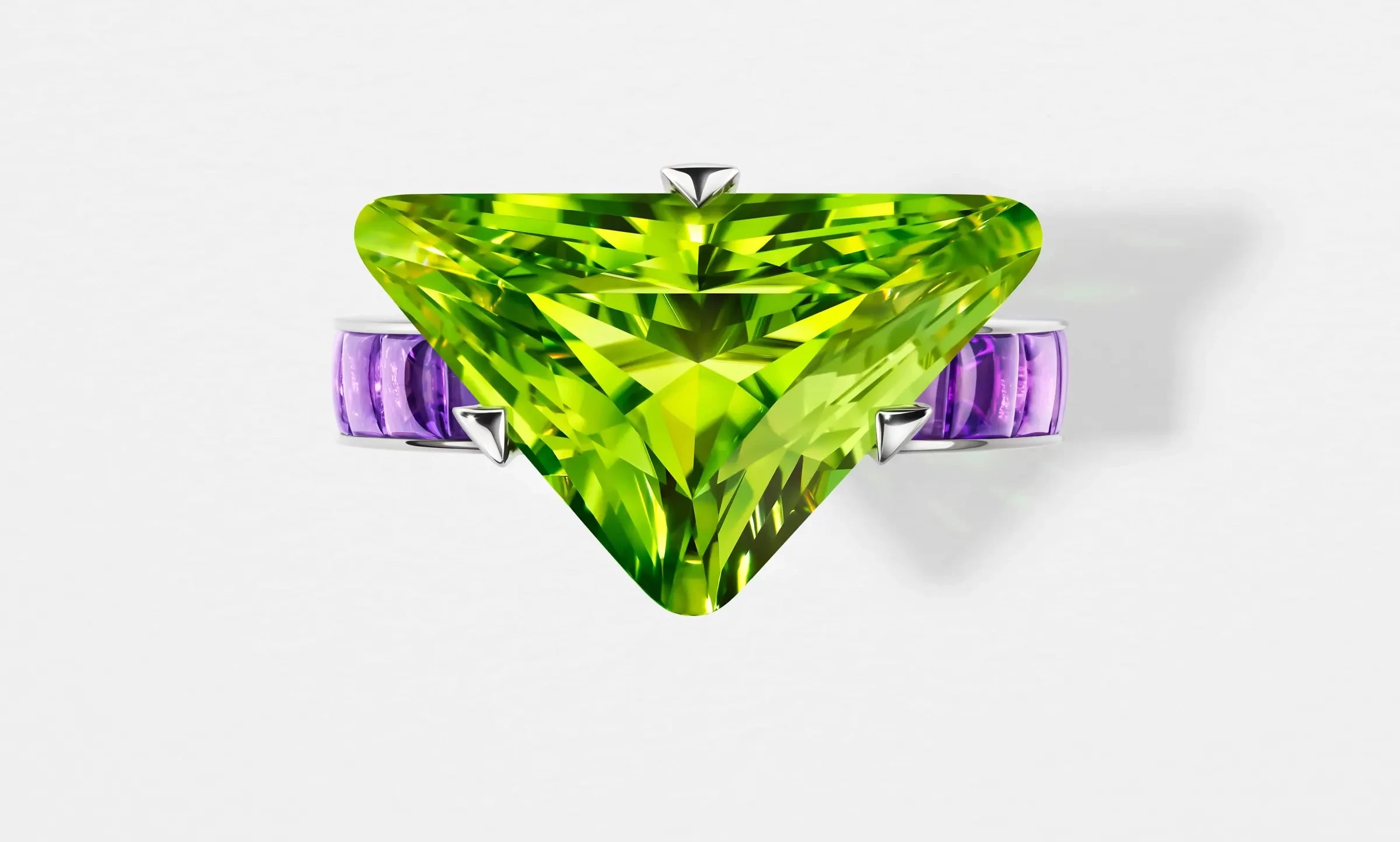
Here, you’ll find aquamarine set against madeira citrine; peridot paired with morganite; pinks clashing joyfully with greens and amber tones. Prada describes the collection as “a study in chromatic dissonance and balance” — a notion more commonly found in painting than jewellery. Amethyst, blue topaz, and oro-verde stones appear not for prestige but for their ability to make you feel something immediate.
Each combination is deliberate, unafraid of veering into the unexpected. This is jewellery as colour-blocking, jewellery as chromatic dialogue. The stones are set in geometric, architectural shapes that reference Prada’s famous triangle emblem and its love of the asymmetrical. There is misalignment, interruption, and visual friction. And yet, every piece resolves in a visual harmony that is distinctly Prada.
Prada’s Couleur Vivante collection - images courtesy of Prada
While the materials speak in colour, the settings speak in form. There are echoes of traditional silhouettes: rivière necklaces, solitaire rings, line bracelets, drop earrings. But there is always a twist — a sudden offset, an angular stone orientation, a contrast in scale.
The result is a jewellery language that’s equal parts classical and disruptive. A pair of drop earrings might mirror each other in form but clash in stone colour. A line bracelet, symmetrical in shape, might be punctuated with a rogue pop of pink. Couleur Vivante toys with the viewer’s expectations. It doesn’t reject traditional forms; it disturbs them gently.
For the accompanying campaign, Prada enlisted photographer David Sims and stylist Katie Burnett to translate the concept visually. The cast is as diverse and multi-dimensional as the collection itself: poet and activist Amanda Gorman, actor Maya Hawke, and South Korean screen star Kim Tae-Ri each lend their own intensity to the imagery.
Shot in monochrome and overlaid with colour fields, the portraits position the jewellery as vivid interruptions in grayscale environments. The jewels pulse with life, offering a visual metaphor for their title. Couleur Vivante isn’t just about decoration; it’s about punctuation.
In addition to its aesthetic rebellion, Couleur Vivante also reflects Prada’s growing commitment to transparency and traceability. Each gemstone in the collection is individually certified and traceable via blockchain, thanks to Prada’s participation in the Aura Consortium. Every stage — from rough stone to final setting — is documented, allowing clients full access to their jewel’s provenance.
This level of documentation places Prada among the few luxury houses genuinely integrating traceability into the luxury experience. It’s not just a nod to ESG values, but an extension of the brand’s intellectual rigour.
Prada’s Couleur Vivante collection - images courtesy of Prada
While Couleur Vivante feels unmistakably modern, its roots are deeply informed by Miuccia Prada’s longstanding fascination with antique jewellery. She is a known collector of early 20th-century pieces and has always brought a sense of historicity to Prada’s seasonal collections — from cameo motifs to baroque embellishments. In this context, Couleur Vivante becomes both a break from and a continuation of the past.
The collection is also reflective of Prada’s wider design language: unexpected material pairings, the celebration of “ugly” beauty, and colour choices that challenge norms. If Prada’s nylon backpack redefined utility as luxury, Couleur Vivantemay just redefine colour as fine jewellery’s most powerful medium.
Couleur Vivante is more than a jewellery collection — it’s a statement of intent. Prada has taken the traditional codes of high jewellery and reprogrammed them through its own lens: intellectual, emotional, and entirely unexpected. At a time when the industry often defaults to heritage and hierarchy, this debut puts colour at the centre — not as an accent, but as the narrative.
What makes it especially significant is not just the chromatic daring or asymmetry, but the underlying philosophy. This is a collection built on tension: between precision and play, restraint and maximalism, classic silhouettes and offbeat executions. And that’s where Prada excels — inhabiting the in-between space, where fashion and meaning collide.
For independent designers and heritage houses alike, Couleur Vivante is a reminder that jewellery doesn’t need to be “perfect” to be powerful. That traceability can sit alongside creativity. That a gemstone doesn’t have to be rare to be resonant. In short, Prada has offered a new framework for thinking about what modern luxury looks and feels like — and we expect others will follow its lead.
Explore Prada’s full Couleur Vivante collection, campaign imagery, and behind-the-scenes creative insights direct from the maison: Prada Fine Jewellery – Couleur Vivante Collection
Credits:
Creative Directors: Miuccia Prada and Raf Simons
Photography: David Sims
Campaign Creative Direction: Ferdinando Verderi
Talents: Amanda Gorman, Maya Hawke, Kim Tae-Ri
Scroll more in the gallery below
Welcome to The Jewels Club
Don’t miss a gem You’ve just stepped inside The Jewels Club — a new home for the stories, people, and ideas shaping the world of jewellery.
READ MORE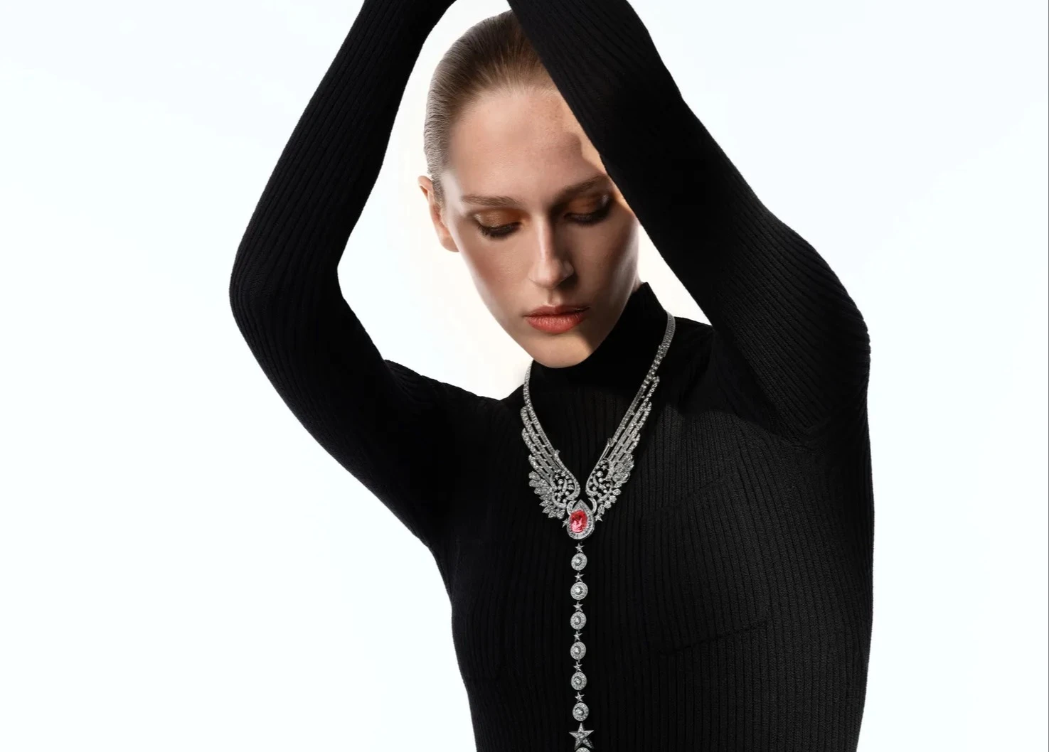
Chanel’s Reach for the Stars: A Celestial Chapter in High Jewellery
The final collection from Patrice Leguéreau blends iconic Chanel codes with bold new symbolism
READ MORE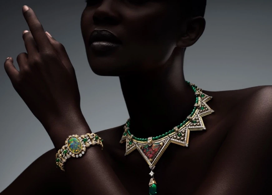
Louis Vuitton’s Virtuosity Collection: Technique Meets Imagination in 110 One-Off Pieces
A two-part high jewellery series that fuses serious stone power with unmissable artistic detail
READ MORE


0 Comments
You must be logged in to comment. Click here to login.